Responsive Web Design
Responsive Web Design: Complete Guide with Tailwind, CSS Grid, Flexbox & Modern Techniques
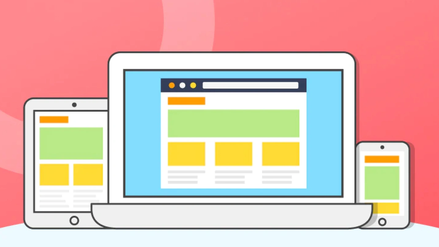
Responsive Web Design (RWD) ensures your website looks and functions perfectly on all devices—from smartphones to desktop computers. With mobile traffic accounting for over 50% of web usage, responsive design isn’t optional—it’s essential.
In this comprehensive guide, you’ll learn:
- What responsive design is and why it matters
- Mobile-first vs desktop-first approaches
- CSS Grid and Flexbox for layouts
- Media queries and breakpoints
- Tailwind CSS for responsive design
- Viewport and meta tags
- Images and typography that scale
- Testing and debugging techniques
- Performance optimization
- Real-world examples and best practices
What is Responsive Web Design?
Responsive Web Design is an approach that makes web pages render well on various devices and screen sizes. Instead of creating separate mobile and desktop versions, you build one flexible website that adapts to any screen.
Key Principles:
- Fluid Grids - Layouts that scale proportionally
- Flexible Images - Media that resizes with containers
- Media Queries - CSS rules for different screen sizes
- Mobile-First - Design for smallest screens first
/* Example: Responsive container */
.container {
  width: 100%;
  max-width: 1200px;
  margin: 0 auto;
  padding: 0 20px;
}

/* Scales from 320px to 1200px */
@media (min-width: 768px) {
  .container {
    padding: 0 40px;
  }
}
Why Responsive Design Matters
User Experience Benefits:
- ✅ Better usability on all devices
- ✅ Consistent experience across platforms
- ✅ Improved accessibility for all users
- ✅ Higher engagement and lower bounce rates
Business Benefits:
- 📈 Better SEO rankings (Google’s mobile-first indexing)
- 📈 Cost-effective (one site vs multiple versions)
- 📈 Easier maintenance and updates
- 📈 Future-proof for new devices
Technical Benefits:
- 🔧 Single codebase to maintain
- 🔧 Consistent branding across devices
- 🔧 Better performance with optimized loading
- 🔧 Progressive enhancement capabilities
Viewport and Meta Tags
The viewport meta tag is crucial for responsive design:
<!DOCTYPE html>
<html lang="en">
<head>
  <meta charset="UTF-8">

  <!-- Essential viewport meta tag -->
  <meta name="viewport" content="width=device-width, initial-scale=1.0">

  <!-- Optional viewport settings -->
  <meta name="viewport" content="width=device-width, initial-scale=1.0, maximum-scale=5.0, user-scalable=yes">

  <title>Responsive Website</title>
</head>
<body>
  <!-- Your content -->
</body>
</html>
Viewport Properties Explained:
<!-- Basic responsive setup -->
<meta name="viewport" content="width=device-width, initial-scale=1.0">

<!-- Advanced settings -->
<meta name="viewport" content="
  width=device-width,     <!-- Use device width -->
  initial-scale=1.0,      <!-- Initial zoom level -->
  maximum-scale=5.0,      <!-- Max zoom allowed -->
  minimum-scale=0.5,      <!-- Min zoom allowed -->
  user-scalable=yes       <!-- Allow user zooming -->
">
Mobile-First vs Desktop-First
Mobile-First Approach (Recommended)
Start designing for mobile, then enhance for larger screens:
/* Mobile styles (default) */
.header {
  padding: 10px;
  font-size: 18px;
}

.navigation {
  display: none; /* Hidden on mobile */
}

.hamburger {
  display: block; /* Visible on mobile */
}

/* Tablet styles */
@media (min-width: 768px) {
  .header {
    padding: 20px;
    font-size: 24px;
  }
}

/* Desktop styles */
@media (min-width: 1024px) {
  .header {
    padding: 30px;
    font-size: 32px;
  }

  .navigation {
    display: flex; /* Show full nav on desktop */
  }

  .hamburger {
    display: none; /* Hide hamburger on desktop */
  }
}
Desktop-First Approach
Start with desktop, then scale down:
/* Desktop styles (default) */
.sidebar {
  width: 300px;
  float: left;
}

.main-content {
  width: calc(100% - 320px);
  float: right;
}

/* Tablet styles */
@media (max-width: 1023px) {
  .sidebar {
    width: 250px;
  }

  .main-content {
    width: calc(100% - 270px);
  }
}

/* Mobile styles */
@media (max-width: 767px) {
  .sidebar,
  .main-content {
    width: 100%;
    float: none;
  }
}
CSS Media Queries
Media queries are the foundation of responsive design:
Basic Media Query Syntax
/* Basic structure */
@media media-type and (condition) {
  /* CSS rules */
}

/* Common examples */
@media screen and (max-width: 768px) {
  /* Styles for screens smaller than 768px */
}

@media screen and (min-width: 1024px) {
  /* Styles for screens larger than 1024px */
}

@media screen and (min-width: 768px) and (max-width: 1023px) {
  /* Styles for tablets only */
}
Standard Breakpoints
/* Extra small devices (phones) */
@media (max-width: 575.98px) {
  .container { padding: 10px; }
}

/* Small devices (landscape phones) */
@media (min-width: 576px) and (max-width: 767.98px) {
  .container { padding: 15px; }
}

/* Medium devices (tablets) */
@media (min-width: 768px) and (max-width: 991.98px) {
  .container { padding: 20px; }
}

/* Large devices (desktops) */
@media (min-width: 992px) and (max-width: 1199.98px) {
  .container { padding: 25px; }
}

/* Extra large devices (large desktops) */
@media (min-width: 1200px) {
  .container { padding: 30px; }
}
Advanced Media Queries
/* Orientation */
@media (orientation: portrait) {
  .hero { height: 60vh; }
}

@media (orientation: landscape) {
  .hero { height: 40vh; }
}

/* High-resolution displays */
@media (-webkit-min-device-pixel-ratio: 2),
       (min-resolution: 192dpi) {
  .logo {
    background-image: url('logo@2x.png');
    background-size: 100px 50px;
  }
}

/* Dark mode support */
@media (prefers-color-scheme: dark) {
  body {
    background-color: #1a1a1a;
    color: #ffffff;
  }
}

/* Reduced motion for accessibility */
@media (prefers-reduced-motion: reduce) {
  * {
    animation-duration: 0.01ms !important;
    animation-iteration-count: 1 !important;
    transition-duration: 0.01ms !important;
  }
}
CSS Grid for Responsive Layouts
CSS Grid is perfect for complex responsive layouts:
Basic Responsive Grid
.grid-container {
  display: grid;
  grid-template-columns: repeat(auto-fit, minmax(300px, 1fr));
  gap: 20px;
  padding: 20px;
}

.grid-item {
  background: #f0f0f0;
  padding: 20px;
  border-radius: 8px;
}<div class="grid-container">
<div class="grid-item">Item 1</div>
<div class="grid-item">Item 2</div>
<div class="grid-item">Item 3</div>
<div class="grid-item">Item 4</div>
</div>Advanced Grid Layout
.page-layout {
  display: grid;
  min-height: 100vh;
  grid-template-areas:
    "header header"
    "sidebar main"
    "footer footer";
  grid-template-columns: 250px 1fr;
  grid-template-rows: auto 1fr auto;
  gap: 20px;
}

.header { grid-area: header; }
.sidebar { grid-area: sidebar; }
.main { grid-area: main; }
.footer { grid-area: footer; }

/* Mobile layout */
@media (max-width: 768px) {
  .page-layout {
    grid-template-areas:
      "header"
      "main"
      "sidebar"
      "footer";
    grid-template-columns: 1fr;
  }
}
Responsive Card Grid
.card-grid {
  display: grid;
  grid-template-columns: repeat(auto-fill, minmax(280px, 1fr));
  gap: 24px;
  padding: 24px;
}

.card {
  background: white;
  border-radius: 12px;
  padding: 24px;
  box-shadow: 0 4px 6px rgba(0, 0, 0, 0.1);
  transition: transform 0.2s;
}

.card:hover {
  transform: translateY(-4px);
}

/* Responsive adjustments */
@media (max-width: 640px) {
  .card-grid {
    grid-template-columns: 1fr;
    gap: 16px;
    padding: 16px;
  }
}
Flexbox for Responsive Components
Flexbox excels at component-level responsive design:
Responsive Navigation
.navbar {
  display: flex;
  justify-content: space-between;
  align-items: center;
  padding: 1rem 2rem;
  background: white;
  box-shadow: 0 2px 4px rgba(0,0,0,0.1);
}

.nav-links {
  display: flex;
  gap: 2rem;
  list-style: none;
}

.nav-toggle {
  display: none;
  flex-direction: column;
  cursor: pointer;
}

/* Mobile navigation */
@media (max-width: 768px) {
  .nav-links {
    position: fixed;
    top: 70px;
    left: -100%;
    width: 100%;
    height: calc(100vh - 70px);
    background: white;
    flex-direction: column;
    justify-content: flex-start;
    align-items: center;
    padding-top: 2rem;
    transition: left 0.3s ease;
  }

  .nav-links.active {
    left: 0;
  }

  .nav-toggle {
    display: flex;
  }
}
Flexible Card Layout
.card-container {
  display: flex;
  flex-wrap: wrap;
  gap: 1.5rem;
  padding: 1.5rem;
}

.card {
  flex: 1 1 300px; /* grow, shrink, basis */
  min-width: 280px;
  background: white;
  border-radius: 8px;
  padding: 1.5rem;
  box-shadow: 0 2px 8px rgba(0,0,0,0.1);
}

/* Force single column on small screens */
@media (max-width: 640px) {
  .card {
    flex: 1 1 100%;
    min-width: auto;
  }
}
Tailwind CSS for Responsive Design
Tailwind makes responsive design incredibly efficient with utility classes:
Responsive Utilities
<!-- Responsive padding -->
<div class="p-4 md:p-6 lg:p-8 xl:p-12">
  Content with responsive padding
</div>

<!-- Responsive text sizes -->
<h1 class="text-2xl md:text-4xl lg:text-6xl font-bold">
  Responsive Heading
</h1>

<!-- Responsive grid -->
<div class="grid grid-cols-1 md:grid-cols-2 lg:grid-cols-3 xl:grid-cols-4 gap-6">
  <div class="bg-white p-6 rounded-lg shadow">Item 1</div>
  <div class="bg-white p-6 rounded-lg shadow">Item 2</div>
  <div class="bg-white p-6 rounded-lg shadow">Item 3</div>
  <div class="bg-white p-6 rounded-lg shadow">Item 4</div>
</div>
Tailwind Breakpoints
<!-- Tailwind breakpoint prefixes -->
<!-- sm: 640px and up -->
<!-- md: 768px and up -->
<!-- lg: 1024px and up -->
<!-- xl: 1280px and up -->
<!-- 2xl: 1536px and up -->

<div class="
  w-full          <!-- Full width on mobile -->
  sm:w-1/2        <!-- Half width on small screens -->
  md:w-1/3        <!-- Third width on medium screens -->
  lg:w-1/4        <!-- Quarter width on large screens -->
  xl:w-1/6        <!-- Sixth width on extra large screens -->
">
  Responsive width
</div>
Complete Responsive Layout with Tailwind
<!DOCTYPE html>
<html lang="en">
<head>
  <meta charset="UTF-8">
  <meta name="viewport" content="width=device-width, initial-scale=1.0">
  <title>Responsive Tailwind Layout</title>
  <script src="https://cdn.tailwindcss.com"></script>
</head>
<body class="bg-gray-50">
  <!-- Navigation -->
  <nav class="bg-white shadow-lg">
    <div class="max-w-7xl mx-auto px-4 sm:px-6 lg:px-8">
      <div class="flex justify-between items-center h-16">
        <!-- Logo -->
        <div class="flex-shrink-0">
          <h1 class="text-xl font-bold text-gray-800">Brand</h1>
        </div>

        <!-- Desktop Navigation -->
        <div class="hidden md:block">
          <div class="ml-10 flex items-baseline space-x-8">
            <a href="#" class="text-gray-600 hover:text-blue-500 px-3 py-2 text-sm font-medium">Home</a>
            <a href="#" class="text-gray-600 hover:text-blue-500 px-3 py-2 text-sm font-medium">About</a>
            <a href="#" class="text-gray-600 hover:text-blue-500 px-3 py-2 text-sm font-medium">Services</a>
            <a href="#" class="text-gray-600 hover:text-blue-500 px-3 py-2 text-sm font-medium">Contact</a>
          </div>
        </div>

        <!-- Mobile menu button -->
        <div class="md:hidden">
          <button class="text-gray-600 hover:text-blue-500">
            <svg class="h-6 w-6" fill="none" viewBox="0 0 24 24" stroke="currentColor">
              <path stroke-linecap="round" stroke-linejoin="round" stroke-width="2" d="M4 6h16M4 12h16M4 18h16" />
            </svg>
          </button>
        </div>
      </div>
    </div>
  </nav>

  <!-- Hero Section -->
  <section class="bg-gradient-to-r from-blue-500 to-purple-600 text-white py-12 md:py-20 lg:py-32">
    <div class="max-w-7xl mx-auto px-4 sm:px-6 lg:px-8 text-center">
      <h1 class="text-3xl md:text-5xl lg:text-6xl font-bold mb-4 md:mb-6">
        Responsive Design
      </h1>
      <p class="text-lg md:text-xl lg:text-2xl mb-6 md:mb-8 text-blue-100 max-w-3xl mx-auto">
        Beautiful websites that work perfectly on all devices
      </p>
      <div class="flex flex-col sm:flex-row gap-4 justify-center">
        <button class="bg-white text-blue-600 font-semibold py-3 px-6 md:px-8 rounded-lg hover:bg-gray-100 transition duration-200">
          Get Started
        </button>
        <button class="border-2 border-white text-white font-semibold py-3 px-6 md:px-8 rounded-lg hover:bg-white hover:text-blue-600 transition duration-200">
          Learn More
        </button>
      </div>
    </div>
  </section>

  <!-- Features Grid -->
  <section class="py-12 md:py-20">
    <div class="max-w-7xl mx-auto px-4 sm:px-6 lg:px-8">
      <div class="text-center mb-12">
        <h2 class="text-2xl md:text-3xl lg:text-4xl font-bold text-gray-800 mb-4">
          Why Choose Responsive Design?
        </h2>
        <p class="text-lg text-gray-600 max-w-2xl mx-auto">
          Create amazing user experiences across all devices
        </p>
      </div>

      <!-- Responsive grid -->
      <div class="grid grid-cols-1 md:grid-cols-2 lg:grid-cols-3 gap-6 lg:gap-8">
        <!-- Feature 1 -->
        <div class="bg-white p-6 lg:p-8 rounded-xl shadow-lg hover:shadow-xl transition duration-300">
          <div class="w-12 h-12 md:w-16 md:h-16 bg-blue-500 rounded-lg flex items-center justify-center mb-4 md:mb-6">
            <svg class="w-6 h-6 md:w-8 md:h-8 text-white" fill="none" stroke="currentColor" viewBox="0 0 24 24">
              <path stroke-linecap="round" stroke-linejoin="round" stroke-width="2" d="M12 18h.01M8 21h8a2 2 0 002-2V5a2 2 0 00-2-2H8a2 2 0 00-2 2v14a2 2 0 002 2z"></path>
            </svg>
          </div>
          <h3 class="text-lg md:text-xl font-semibold text-gray-800 mb-3 md:mb-4">Mobile First</h3>
          <p class="text-gray-600 text-sm md:text-base">Designed for mobile devices, enhanced for desktop.</p>
        </div>

        <!-- Feature 2 -->
        <div class="bg-white p-6 lg:p-8 rounded-xl shadow-lg hover:shadow-xl transition duration-300">
          <div class="w-12 h-12 md:w-16 md:h-16 bg-green-500 rounded-lg flex items-center justify-center mb-4 md:mb-6">
            <svg class="w-6 h-6 md:w-8 md:h-8 text-white" fill="none" stroke="currentColor" viewBox="0 0 24 24">
              <path stroke-linecap="round" stroke-linejoin="round" stroke-width="2" d="M9.75 17L9 20l-1 1h8l-1-1-.75-3M3 13h18M5 17h14a2 2 0 002-2V5a2 2 0 00-2-2H5a2 2 0 00-2 2v10a2 2 0 002 2z"></path>
            </svg>
          </div>
          <h3 class="text-lg md:text-xl font-semibold text-gray-800 mb-3 md:mb-4">Cross Device</h3>
          <p class="text-gray-600 text-sm md:text-base">Perfect experience on phones, tablets, and desktops.</p>
        </div>

        <!-- Feature 3 -->
        <div class="bg-white p-6 lg:p-8 rounded-xl shadow-lg hover:shadow-xl transition duration-300 md:col-span-2 lg:col-span-1">
          <div class="w-12 h-12 md:w-16 md:h-16 bg-purple-500 rounded-lg flex items-center justify-center mb-4 md:mb-6">
            <svg class="w-6 h-6 md:w-8 md:h-8 text-white" fill="none" stroke="currentColor" viewBox="0 0 24 24">
              <path stroke-linecap="round" stroke-linejoin="round" stroke-width="2" d="M13 10V3L4 14h7v7l9-11h-7z"></path>
            </svg>
          </div>
          <h3 class="text-lg md:text-xl font-semibold text-gray-800 mb-3 md:mb-4">Fast Loading</h3>
          <p class="text-gray-600 text-sm md:text-base">Optimized performance for all connection speeds.</p>
        </div>
      </div>
    </div>
  </section>
</body>
</html>
Responsive Images and Media
Responsive Images with HTML
<!-- Basic responsive image -->
<img src="image.jpg" alt="Description" style="max-width: 100%; height: auto;">

<!-- Responsive images with srcset -->
<img
  src="image-800w.jpg"
  srcset="
    image-400w.jpg 400w,
    image-800w.jpg 800w,
    image-1200w.jpg 1200w
  "
  sizes="(max-width: 640px) 100vw, (max-width: 1024px) 50vw, 33vw"
  alt="Responsive image"
>

<!-- Picture element for art direction -->
<picture>
  <source media="(max-width: 640px)" srcset="mobile-image.jpg">
  <source media="(max-width: 1024px)" srcset="tablet-image.jpg">
  <img src="desktop-image.jpg" alt="Responsive image">
</picture>
CSS for Responsive Images
/* Basic responsive images */
img {
  max-width: 100%;
  height: auto;
}

/* Responsive background images */
.hero-bg {
  background-image: url('hero-mobile.jpg');
  background-size: cover;
  background-position: center;
  height: 50vh;
}

@media (min-width: 768px) {
  .hero-bg {
    background-image: url('hero-tablet.jpg');
    height: 60vh;
  }
}

@media (min-width: 1024px) {
  .hero-bg {
    background-image: url('hero-desktop.jpg');
    height: 80vh;
  }
}

/* Aspect ratio containers */
.video-container {
  position: relative;
  width: 100%;
  height: 0;
  padding-bottom: 56.25%; /* 16:9 aspect ratio */
}

.video-container iframe {
  position: absolute;
  top: 0;
  left: 0;
  width: 100%;
  height: 100%;
}
Responsive Video
<!-- Responsive embedded video -->
<div class="video-wrapper">
  <iframe
    src="https://www.youtube.com/embed/VIDEO_ID"
    frameborder="0"
    allowfullscreen>
  </iframe>
</div>

<style>
.video-wrapper {
  position: relative;
  padding-bottom: 56.25%; /* 16:9 */
  height: 0;
  overflow: hidden;
}

.video-wrapper iframe {
  position: absolute;
  top: 0;
  left: 0;
  width: 100%;
  height: 100%;
}
</style>
Responsive Typography
Fluid Typography
/* Clamp function for fluid typography */
h1 {
  font-size: clamp(2rem, 5vw, 4rem);
  line-height: 1.2;
}

h2 {
  font-size: clamp(1.5rem, 4vw, 3rem);
}

p {
  font-size: clamp(1rem, 2.5vw, 1.25rem);
  line-height: 1.6;
}

/* Traditional responsive typography */
.heading {
  font-size: 24px;
}

@media (min-width: 768px) {
  .heading {
    font-size: 32px;
  }
}

@media (min-width: 1024px) {
  .heading {
    font-size: 48px;
  }
}
Responsive Text Scaling
/* Base font size scaling */
html {
  font-size: 14px;
}

@media (min-width: 640px) {
  html { font-size: 15px; }
}

@media (min-width: 768px) {
  html { font-size: 16px; }
}

@media (min-width: 1024px) {
  html { font-size: 17px; }
}

@media (min-width: 1280px) {
  html { font-size: 18px; }
}

/* Use rem units for scalable typography */
h1 { font-size: 2.5rem; }
h2 { font-size: 2rem; }
h3 { font-size: 1.5rem; }
p { font-size: 1rem; }
Testing Responsive Design
Browser Developer Tools
// Test common breakpoints
const breakpoints = [
  { name: 'Mobile', width: 375, height: 667 },
  { name: 'Mobile Large', width: 414, height: 896 },
  { name: 'Tablet', width: 768, height: 1024 },
  { name: 'Desktop', width: 1024, height: 768 },
  { name: 'Desktop Large', width: 1440, height: 900 }
];

// Chrome DevTools device simulation
// 1. Open DevTools (F12)
// 2. Click device toggle (Ctrl+Shift+M)
// 3. Select device or set custom dimensions
Online Testing Tools
Testing Checklist
## Responsive Testing Checklist

### Breakpoints
- [ ] 320px (Small mobile)
- [ ] 375px (iPhone)
- [ ] 414px (Large mobile)
- [ ] 768px (Tablet portrait)
- [ ] 1024px (Tablet landscape/Small desktop)
- [ ] 1280px (Desktop)
- [ ] 1920px (Large desktop)

### Elements to Test
- [ ] Navigation (hamburger menu)
- [ ] Images (scaling and loading)
- [ ] Text (readability and sizing)
- [ ] Forms (input sizing and usability)
- [ ] Buttons (touch targets)
- [ ] Grid layouts (column stacking)
- [ ] Performance (loading times)

### Orientation Testing
- [ ] Portrait mode
- [ ] Landscape mode
- [ ] Orientation change handling
Performance Optimization
Optimize Images
<!-- Use WebP format with fallback -->
<picture>
  <source srcset="image.webp" type="image/webp">
  <img src="image.jpg" alt="Optimized image">
</picture>

<!-- Lazy loading -->
<img src="image.jpg" alt="Description" loading="lazy">

<!-- Responsive images with optimization -->
<img
  src="image-400w.webp"
  srcset="
    image-400w.webp 400w,
    image-800w.webp 800w,
    image-1200w.webp 1200w
  "
  sizes="(max-width: 640px) 100vw, 50vw"
  alt="Optimized responsive image"
  loading="lazy"
>
CSS Optimization
/* Use efficient selectors */
.card { /* Good */ }
div.card { /* Less efficient */ }
div > div > .card { /* Avoid */ }

/* Minimize repaints and reflows */
.element {
  transform: translateX(100px); /* Better */
  /* left: 100px; */ /* Causes reflow */
}

/* Use CSS containment */
.card {
  contain: layout style paint;
}
Critical CSS
<head>
  <!-- Inline critical CSS -->
  <style>
    /* Above-the-fold styles */
    body { margin: 0; font-family: sans-serif; }
    .header { background: #fff; padding: 1rem; }
    .hero { height: 100vh; background: #f0f0f0; }
  </style>

  <!-- Load non-critical CSS asynchronously -->
  <link rel="preload" href="styles.css" as="style" onload="this.onload=null;this.rel='stylesheet'">
  <noscript><link rel="stylesheet" href="styles.css"></noscript>
</head>
Common Responsive Patterns
Card Grid Pattern
.card-grid {
  display: grid;
  grid-template-columns: repeat(auto-fit, minmax(280px, 1fr));
  gap: 1.5rem;
  padding: 1.5rem;
}

.card {
  background: white;
  border-radius: 8px;
  padding: 1.5rem;
  box-shadow: 0 2px 8px rgba(0,0,0,0.1);
}
Sidebar Layout Pattern
.layout {
  display: grid;
  grid-template-columns: 250px 1fr;
  gap: 2rem;
  min-height: 100vh;
}

@media (max-width: 768px) {
  .layout {
    grid-template-columns: 1fr;
  }

  .sidebar {
    order: 2; /* Move sidebar after main content */
  }
}
Navigation Pattern
.nav {
  display: flex;
  justify-content: space-between;
  align-items: center;
}

.nav-links {
  display: flex;
  gap: 2rem;
}

.nav-toggle {
  display: none;
}

@media (max-width: 768px) {
  .nav-links {
    position: fixed;
    top: 100%;
    left: 0;
    width: 100%;
    background: white;
    flex-direction: column;
    padding: 2rem;
    transform: translateY(-100%);
    transition: transform 0.3s ease;
  }

  .nav-links.active {
    transform: translateY(0);
  }

  .nav-toggle {
    display: block;
  }
}
Accessibility in Responsive Design
Touch Targets
/* Minimum 44px touch targets */
.button {
  min-height: 44px;
  min-width: 44px;
  padding: 12px 24px;
}

/* Increase spacing on mobile */
@media (max-width: 768px) {
  .nav-link {
    padding: 16px;
    margin: 8px 0;
  }
}
Focus Management
/* Visible focus indicators */
.button:focus {
  outline: 2px solid #007acc;
  outline-offset: 2px;
}

/* Skip links for keyboard navigation */
.skip-link {
  position: absolute;
  top: -40px;
  left: 6px;
  background: #000;
  color: #fff;
  padding: 8px;
  text-decoration: none;
  transition: top 0.3s;
}

.skip-link:focus {
  top: 6px;
}
Screen Reader Considerations
<!-- Hide decorative elements from screen readers -->
<img src="decoration.png" alt="" aria-hidden="true">

<!-- Provide context for responsive navigation -->
<button
  class="nav-toggle"
  aria-expanded="false"
  aria-controls="navigation"
  aria-label="Toggle navigation menu"
>
  <span></span>
  <span></span>
  <span></span>
</button>

<nav id="navigation" aria-label="Main navigation">
  <!-- Navigation items -->
</nav>
Best Practices & Tips
Design Principles
/* 1. Use relative units */
.container {
  width: 90%;
  max-width: 1200px;
  margin: 0 auto;
}

/* 2. Flexible images */
img {
  max-width: 100%;
  height: auto;
}

/* 3. Readable line lengths */
p {
  max-width: 65ch; /* Optimal reading width */
}

/* 4. Adequate spacing */
.section {
  padding: clamp(2rem, 5vw, 4rem) 0;
}
Performance Tips
- ⚡ Optimize images - Use WebP, lazy loading, and appropriate sizes
- ⚡ Minimize CSS - Remove unused styles and use efficient selectors
- ⚡ Critical path - Inline above-the-fold CSS
- ⚡ Reduce HTTP requests - Combine files where possible
- ⚡ Use CDNs - Serve assets from global edge locations
Common Mistakes to Avoid
- ❌ Fixed widths - Always use flexible units
- ❌ Tiny touch targets - Minimum 44px for mobile
- ❌ Horizontal scrolling - Test on small screens
- ❌ Unreadable text - Ensure adequate contrast and size
- ❌ Slow loading - Optimize images and minimize CSS
Free Resources & Tools
Learning Resources
- 📚 MDN Responsive Design
- 📚 CSS-Tricks Complete Guide to Flexbox
- 📚 CSS-Tricks Complete Guide to Grid
- 📚 Responsive Web Design Fundamentals
Tools & Testing
Frameworks & Libraries
- 🎨 Tailwind CSS - Utility-first framework
- 🎨 Bootstrap - Component-based framework
- 🎨 Bulma - Modern CSS framework
- 🎨 Foundation - Advanced responsive framework
Final Thoughts
Responsive web design is not just about making websites work on mobile devices—it’s about creating flexible, accessible, and performant experiences for all users, regardless of their device or context.
Pro Tip: Start every project mobile-first. Design and code for the smallest screen first, then enhance for larger screens. This approach leads to better performance, cleaner code, and superior user experiences.
The key to mastering responsive design is understanding that it’s not a destination but a mindset. Every design decision should consider how it will work across the full spectrum of devices and user contexts.
Next Steps:
- Practice building layouts with CSS Grid and Flexbox
- Learn Tailwind CSS for rapid responsive development
- Test your designs on real devices, not just browser tools
- Focus on performance optimization from day one
- Always consider accessibility in your responsive designs
Remember: Great responsive design is invisible to users—it just works, everywhere, for everyone.
Interactive Responsive Design Example
Here’s a live example you can interact with to see responsive design in action. Try resizing your browser window to see how the layout adapts:
<!DOCTYPE html>
<html lang="en">
<head>
  <meta charset="UTF-8">
  <meta name="viewport" content="width=device-width, initial-scale=1.0">
  <title>Interactive Responsive Design Demo</title>
  <style>
    * {
      box-sizing: border-box;
      margin: 0;
      padding: 0;
    }

    body {
      font-family: 'Inter', -apple-system, BlinkMacSystemFont, sans-serif;
      line-height: 1.6;
      color: #333;
      background: #f5f5f5;
    }

    .header {
      background: #2563eb;
      color: white;
      padding: 2rem;
      text-align: center;
      box-shadow: 0 2px 4px rgba(0, 0, 0, 0.1);
    }

    .header h1 {
      font-size: clamp(1.8rem, 4vw, 3rem);
      margin-bottom: 0.5rem;
      font-weight: 700;
    }

    .header p {
      font-size: clamp(1rem, 2vw, 1.2rem);
      opacity: 0.9;
    }

    .container {
      display: grid;
      grid-template-columns: 250px 1fr 300px;
      gap: 2rem;
      max-width: 1400px;
      margin: 2rem auto;
      padding: 0 1rem;
    }

    .sidebar {
      background: white;
      border-radius: 8px;
      box-shadow: 0 2px 8px rgba(0, 0, 0, 0.1);
      overflow: hidden;
      height: fit-content;
      position: sticky;
      top: 2rem;
    }

    .sidebar h3 {
      background: #1e40af;
      color: white;
      padding: 1rem;
      margin: 0;
      font-size: 1.1rem;
    }

    .menu-item {
      padding: 1rem;
      border-bottom: 1px solid #e5e7eb;
      cursor: pointer;
      transition: all 0.2s ease;
      display: flex;
      align-items: center;
      gap: 0.5rem;
    }

    .menu-item:hover {
      background: #f3f4f6;
      transform: translateX(4px);
    }

    .menu-item.active {
      background: #dbeafe;
      border-left: 4px solid #2563eb;
      color: #1e40af;
      font-weight: 600;
    }

    .menu-item:last-child {
      border-bottom: none;
    }

    .main-content {
      background: white;
      border-radius: 8px;
      padding: 2rem;
      box-shadow: 0 2px 8px rgba(0, 0, 0, 0.1);
    }

    .main-content h2 {
      color: #1f2937;
      margin-bottom: 1rem;
      font-size: clamp(1.5rem, 3vw, 2rem);
    }

    .main-content p {
      margin-bottom: 1.5rem;
      color: #6b7280;
      font-size: 1.1rem;
    }

    .demo-image {
      width: 100%;
      height: 300px;
      background: #6b7280;
      border-radius: 8px;
      display: flex;
      align-items: center;
      justify-content: center;
      color: white;
      font-size: 1.2rem;
      margin: 1.5rem 0;
    }

    .info-panel {
      background: white;
      border-radius: 8px;
      box-shadow: 0 2px 8px rgba(0, 0, 0, 0.1);
      overflow: hidden;
      height: fit-content;
      position: sticky;
      top: 2rem;
    }

    .info-panel h3 {
      background: #059669;
      color: white;
      padding: 1rem;
      margin: 0;
      font-size: 1.1rem;
    }

    .info-item {
      padding: 1.5rem;
      border-bottom: 1px solid #e5e7eb;
    }

    .info-item:last-child {
      border-bottom: none;
    }

    .info-item h4 {
      color: #1f2937;
      margin-bottom: 0.5rem;
      font-size: 1rem;
    }

    .info-item p {
      color: #6b7280;
      font-size: 0.9rem;
      margin: 0;
    }

    .screen-indicator {
      position: fixed;
      top: 1rem;
      right: 1rem;
      background: #1f2937;
      color: white;
      padding: 0.5rem 1rem;
      border-radius: 20px;
      font-size: 0.8rem;
      z-index: 1000;
      transition: all 0.3s ease;
    }

    /* Tablet Layout */
    @media (max-width: 1024px) {
      .container {
        grid-template-columns: 200px 1fr;
        gap: 1.5rem;
      }

      .info-panel {
        grid-column: 1 / -1;
        order: 3;
        position: static;
      }

      .info-panel .info-item {
        display: inline-block;
        width: calc(50% - 1rem);
        margin: 0.5rem;
        border: 1px solid #e5e7eb;
        border-radius: 8px;
        vertical-align: top;
      }
    }

    /* Mobile Layout */
    @media (max-width: 768px) {
      .container {
        grid-template-columns: 1fr;
        gap: 1rem;
        margin: 1rem auto;
      }

      .sidebar {
        position: static;
        order: 1;
      }

      .sidebar h3 {
        display: none; /* Hide navigation title on mobile */
      }

      .sidebar {
        border-radius: 8px;
        background: white;
        box-shadow: 0 2px 8px rgba(0, 0, 0, 0.1);
      }

      /* Horizontal navigation bar on mobile */
      .sidebar {
        display: flex;
        flex-direction: column;
        gap: 0;
      }

      .menu-item {
        flex: 1;
        text-align: center;
        padding: 0.8rem;
        border-bottom: 1px solid #e5e7eb;
        border-right: none;
        justify-content: center;
      }

      .menu-item:hover {
        transform: none;
        background: #f3f4f6;
      }

      .menu-item.active {
        background: #2563eb;
        color: white;
        border-left: none;
        border-bottom: 1px solid #e5e7eb;
      }

      .main-content {
        order: 2;
        padding: 1.5rem;
      }

      .info-panel {
        order: 3;
        position: static;
      }

      .info-panel .info-item {
        display: block;
        width: auto;
        margin: 0;
        border: none;
        border-bottom: 1px solid #e5e7eb;
        border-radius: 0;
      }

      .header {
        padding: 1.5rem 1rem;
      }
    }

    /* Small Mobile - Stack navigation vertically */
    @media (max-width: 480px) {
      .header {
        padding: 1rem;
      }

      .main-content {
        padding: 1rem;
      }

      .demo-image {
        height: 200px;
        font-size: 1rem;
      }

      .sidebar {
        flex-direction: column;
      }

      .menu-item {
        text-align: left;
        justify-content: flex-start;
      }
    }

    /* Animation for smooth transitions */
    .container > * {
      transition: all 0.3s ease;
    }

    /* Interactive hover effects */
    .main-content:hover {
      transform: translateY(-2px);
      box-shadow: 0 4px 12px rgba(0, 0, 0, 0.15);
    }

    .sidebar:hover, .info-panel:hover {
      transform: translateY(-1px);
      box-shadow: 0 4px 12px rgba(0, 0, 0, 0.15);
    }
  </style>
</head>
<body>
  <header class="header">
    <h1>🎨 Responsive Design Demo</h1>
    <p>Resize your browser window to see the magic happen!</p>
  </header>

  <div class="screen-indicator" id="screenIndicator">
    Desktop View
  </div>

  <div class="container">
    <aside class="sidebar">
      <h3>📱 Navigation</h3>
      <div class="menu-item active" onclick="setActive(this)">
        🏠 Overview
      </div>
      <div class="menu-item" onclick="setActive(this)">
        📊 Features
      </div>
      <div class="menu-item" onclick="setActive(this)">
        🎯 Examples
      </div>
      <div class="menu-item" onclick="setActive(this)">
        📚 Resources
      </div>
      <div class="menu-item" onclick="setActive(this)">
        💡 Tips
      </div>
    </aside>

    <main class="main-content">
      <h2>Responsive Web Design in Action</h2>
      <p>
        This layout demonstrates how responsive design adapts to different screen sizes.
        On desktop, you see a three-column layout with navigation, main content, and sidebar.
        On tablet, it becomes two columns. On mobile, the navigation moves to the top as a horizontal bar, followed by the main content.
      </p>

      <div class="demo-image">
        <span>📱 Responsive Image Placeholder</span>
      </div>

      <p>
        <strong>Try this:</strong> Slowly resize your browser window and watch how the layout
        smoothly transitions between different breakpoints. Notice how the navigation changes
        from a sidebar to a top bar on mobile devices.
      </p>

      <p>
        The magic happens through CSS Grid, Flexbox, and media queries working together
        to create a seamless user experience that works perfectly on any device.
      </p>
    </main>

    <aside class="info-panel">
      <h3>💡 Quick Info</h3>
      <div class="info-item">
        <h4>🖥️ Desktop</h4>
        <p>Three-column layout with sidebar navigation</p>
      </div>
      <div class="info-item">
        <h4>📱 Tablet</h4>
        <p>Two-column layout with info panel at bottom</p>
      </div>
      <div class="info-item">
        <h4>📱 Mobile</h4>
        <p>Single-column with top navigation bar</p>
      </div>
      <div class="info-item">
        <h4>⚡ Performance</h4>
        <p>Optimized for fast loading on all devices</p>
      </div>
    </aside>
  </div>

  <script>
    // Interactive functionality
    function setActive(element) {
      // Remove active class from all menu items
      document.querySelectorAll('.menu-item').forEach(item => {
        item.classList.remove('active');
      });

      // Add active class to clicked item
      element.classList.add('active');

      // Update main content based on selection
      const mainContent = document.querySelector('.main-content h2');
      const mainText = document.querySelector('.main-content p');

      const content = {
        '🏠 Overview': {
          title: 'Responsive Web Design in Action',
          text: 'This layout demonstrates how responsive design adapts to different screen sizes. Watch how the navigation changes from sidebar to top bar as you resize your browser window!'
        },
        '📊 Features': {
          title: 'Key Responsive Features',
          text: 'CSS Grid for layout structure, Flexbox for component alignment, Media queries for breakpoints, and Clean design with simple colors instead of complex gradients.'
        },
        '🎯 Examples': {
          title: 'Real-World Examples',
          text: 'Navigation that transforms from sidebar to top bar on mobile, Images that scale proportionally, Content that reorders for better mobile experience, and Touch-friendly interactive elements.'
        },
        '📚 Resources': {
          title: 'Learning Resources',
          text: 'MDN Web Docs for comprehensive guides, CSS-Tricks for practical examples, Can I Use for browser compatibility, and Google Web Fundamentals for best practices.'
        },
        '💡 Tips': {
          title: 'Pro Tips for Responsive Design',
          text: 'Always start mobile-first, Test on real devices not just browser tools, Use simple color schemes for better performance, and Keep navigation patterns consistent across breakpoints.'
        }
      };

      const selectedContent = content[element.textContent.trim()];
      if (selectedContent) {
        mainContent.textContent = selectedContent.title;
        mainText.textContent = selectedContent.text;
      }
    }

    // Screen size indicator
    function updateScreenIndicator() {
      const indicator = document.getElementById('screenIndicator');
      const width = window.innerWidth;

      if (width <= 480) {
        indicator.textContent = '📱 Small Mobile';
        indicator.style.background = '#dc2626';
      } else if (width <= 768) {
        indicator.textContent = '📱 Mobile';
        indicator.style.background = '#ea580c';
      } else if (width <= 1024) {
        indicator.textContent = '📱 Tablet';
        indicator.style.background = '#059669';
      } else {
        indicator.textContent = '🖥️ Desktop';
        indicator.style.background = '#2563eb';
      }
    }

    // Update indicator on load and resize
    window.addEventListener('load', updateScreenIndicator);
    window.addEventListener('resize', updateScreenIndicator);

    // Add smooth scrolling for better UX
    document.querySelectorAll('.menu-item').forEach(item => {
      item.addEventListener('click', () => {
        document.querySelector('.main-content').scrollIntoView({
          behavior: 'smooth',
          block: 'start'
        });
      });
    });
  </script>
</body>
</html>
How This Example Works:
🎯 Key Features:
- Live screen size indicator - Shows current breakpoint in real-time
- Interactive navigation - Click menu items to see content changes
- Smooth transitions - CSS animations make layout changes feel natural
- Modern styling - Clean, professional design with gradients and shadows
📱 Responsive Breakpoints:
- Desktop (1024px+): Three-column layout with full sidebar
- Tablet (768px-1024px): Two-column layout, info panel moves to bottom
- Mobile (480px-768px): Single-column with top navigation bar
- Small Mobile (<480px): Compact spacing, larger touch targets
💡 Interactive Elements:
- Click navigation items to change content
- Hover effects on cards and panels
- Real-time screen size detection
- Smooth scrolling between sections
🔧 Technical Highlights:
- CSS Grid for main layout structure
- Flexbox for component alignment
- CSS custom properties for consistent theming
- JavaScript for interactive functionality
- Semantic HTML for accessibility
This example perfectly demonstrates responsive design principles in action while being engaging and educational for users learning about responsive web design!